Color is one of the most powerful tools in commercial design and branding. It influences how people feel, how they behave, and even how long they stay in a space. In business environments, color carries meaning and emotion, often shaping first impressions before a customer ever interacts with a product or service. Companies that understand color psychology can strengthen their brand identity, influence customer decisions, and create spaces that support productivity and success.
The Role of Color in Brand Identity
Color is a universal language that communicates instantly. Brands rely on color to express their values and personality. A strong brand palette helps customers recognize a company at a glance, whether on signage, walls, packaging, or marketing materials. For example, many financial institutions use blues because they convey trust, security, and professionalism. A modern technology company might choose crisp whites and cool hues to represent innovation and simplicity. Warm, earthy tones are often used by wellness or health-focused brands because they evoke calm, nature, and connection.
When businesses use colors consistently in their physical spaces, they reinforce brand identity. Walking into a store or office that reflects the company’s color palette builds recognition and trust. It also creates cohesion between the digital brand and in-person experience. This consistency helps customers feel connected to the brand and more confident in their decision to engage with the business.
Creating Spaces That Influence Behavior
Every commercial space has a purpose, and color plays a major role in guiding how people interact within it. Different hues can evoke specific emotional and physical responses, making them a critical part of design strategy.
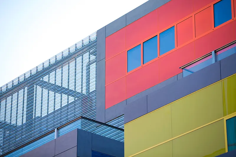
Warm colors, like reds, oranges, and yellows, create energy and encourage movement. Restaurants often use these tones because they can stimulate appetite and create a lively atmosphere. Retail stores may choose bright and bold colors to inspire excitement and quick purchasing decisions.
Cool colors, including blues and greens, are known for their calming and soothing effects. Offices and medical settings often use these shades to reduce stress, promote focus, and create a sense of stability. Spa environments and wellness centers lean heavily toward soft greens and natural earthy hues to promote relaxation and groundedness.
Neutral colors—whites, grays, and beiges—are versatile and timeless. They allow other design elements to stand out, making them ideal for modern, minimalist, or luxury commercial spaces. Neutrals also create a sense of cleanliness, which is particularly important for professional services, healthcare spaces, and upscale retail.
Designing Purposeful Commercial Environments
Color psychology allows designers and painting professionals to create purposeful spaces where each area supports its intended function. A well-designed commercial environment doesn’t rely on a single mood throughout the entire property. Instead, it uses different colors strategically based on how the space will be used.
In an office, conference rooms may benefit from calm blues or muted greens that promote clear thinking and collaboration. Creative spaces, such as marketing or design departments, might incorporate brighter colors like yellows or vibrant accents to spark imagination and innovation. Break rooms often use cheerful or inviting colors to help employees relax and recharge.
In customer-facing environments, such as retail stores or hospitality settings, color choices directly influence the customer experience. A boutique that wants to create a sense of luxury might choose deep, rich colors paired with metallic accents. A modern café may use warm woods, soft lighting, and subtle earthy tones to make the space feel cozy and inviting.
The Psychological Impact on Atmosphere and Experience
Beyond branding and behavior, color sets the emotional tone for an entire space. Atmosphere plays a crucial role in customer satisfaction, employee morale, and the overall perception of the business.
A brightly lit commercial gym with bold, energetic colors can motivate people to feel more active and engaged. On the other hand, a high-end spa using soft neutrals and pastels helps clients feel calm and rejuvenated. Retail environments benefit from a balance of inviting tones that keep customers browsing longer without feeling overwhelmed.
Even subtle shifts in color temperature—cool versus warm shades—can influence how large or small a room feels, how relaxing a space becomes, and how professional or upscale an environment appears.
Working With Professionals to Choose the Right Colors
Selecting the ideal color palette for a commercial space goes far beyond personal preference. It requires an understanding of brand identity, customer psychology, lighting conditions, architectural style, and the overall goals of the business. Professional painters and designers have the expertise to evaluate these factors and recommend colors that enhance both the aesthetic and functional qualities of the space.
By applying color psychology intentionally, businesses can transform their commercial spaces into environments that not only look polished and professional but also support marketing strategies, improve customer experience, and strengthen brand identity. The right colors help create memorable spaces that inspire trust, encourage engagement, and leave a lasting impression.